
Introduction
The last iPhone I had was the 3GS - it's been that long. I remember it was a hand-me-down from my sister, who gave it to me after using it for 2 years, so it wasn't exactly cutting edge even at the time, and it was a decade ago.
Now, I got myself the iPhone 13 Pro - the best hardware that Apple has in a compact form factor. How did I get here, and how do I feel about it? Well, it's complicated.
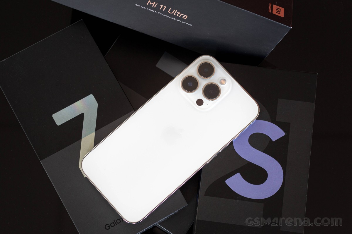
I've been using Android phones - personally and on the job for years - the best of them, really. I've always had a preference for more compact-sized devices. Most recently, I used the Galaxy S21 for a good while after its release. I appreciated it for its compact size and capable cameras, which I've always preferred to the ones on the S21 Ultra. The S21 was a solid phone that just worked, but it was unexciting enough that I kept looking elsewhere. And being lucky to work where I do, options were readily available.
At one point, I ended up trying the Mi 11 Ultra for size - not remotely compact but appealing in ways that the Galaxy couldn't be. The Mi 11 Ultra has probably the best build and in-hand feel of any device this reviewer has handled and a camera system that's second to none. Ultimately though, it didn't take long for me to realize that I was too set in my Samsung ways, and there were things about the Mi that I wasn't willing to put up with. Small things, and not a whole lot of them, but that's how much I was willing to compromise.
Back to the Galaxy S21 it was, but I had my eyes open for replacement candidates. I also gave the Find X3 Pro a chance, but it was little more than a fling that I knew wasn't going to last. Predictably, it didn't, but this time I hadn't even reset the S21, so I hopped back on as if nothing had happened.
The Samsung foldables arrived in late summer, and those gave me hope - I could stay within the Galaxy Galaxy family but get something sexier. I started out with a Z Flip3 only to end up unimpressed by its objectively unimpressive cameras, disappointed by its poor use of the second display, and generally feeling meh about what I had perceived as the perfect form factor for my tastes.
It was only logical then that I gave the other foldable form factor a go, and I smartswitched my stuff to the Z Fold3. Physically a polar opposite to the S21, the Fold is heavy and bulky, but it had the big screen to show for it and managed to stick for a couple of weeks. At no point was I going to keep it permanently as Samsung is not a company to replace screens on review phones for free, and I sure wasn't willing to face a broken screen replacement bill worth... what is it, $500/€600... just due to normal use. Just as it happened on our Fold2 review unit after a year of use. I really don't believe these devices are as reliable as normal phones, at least not just yet. So again, this did not last very much.
By that time of the year, we were already in iPhone season. And Apple, how conveniently, had made one just the way I wanted it. The 13 Pro was small(-ish), and even if it weighed as much as a big non-Apple one, it ticked the 'compact' checkbox for me. Also, very importantly, it now came with the top-specced cameras, unlike the 12th generation where the non-Max was denied those. I had run out of excuses for not getting an iPhone.
So, I got an iPhone. And I paid for it out of my own pocket. It wasn't something that I had just picked up from the pile of phones we keep on our office shelves. Admittedly, we don't have any iPhones gathering dust on the shelves at the office - things might have turned out differently if we did.
Anyway, on the next couple of pages, I'll be sharing how this switch has been going for me with all the ups and downs. There is stuff I don't appreciate and stuff I love about it. Nothing gets a reviewer off more than grumbling about tech, so let's kick off with that, shall we?
iOS
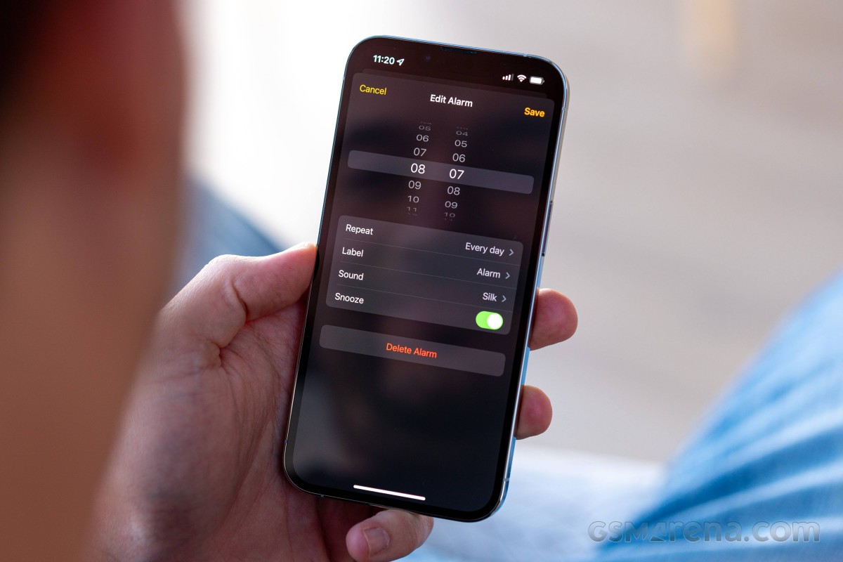
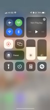
Seriously, how can there not be a separate volume setting for the alarm? Sure, there is a slider if you set up your alarm from the Sleep utility, but that very utility is a clunky and overly complicated way to go about your sleep/wake up routine, I think. I want a simple alarm that won't tell me when to go to sleep or change my lockscreen, but I still want at least some level of control. The lack of a setting for snooze interval is easier to live with but not ideal either.
It's little things of this sort, annoyances rather than actual issues, that I've had to learn to accept and live with. I've been told that's just the iOS way - simple to a fault. It's what allows it to be so fast and fluid and all that, and while I do appreciate the smoothness, the balance point could be nudged towards just a handful of extra customizability, maybe?
I should point out here that I got the iPhone well aware of its software quirks and fully expecting there will be concessions to be made in terms of functionality. I wanted its hardware, though, and that was a price I was willing to pay. Having said that, right from the get-go, I tried to limit the Apple software in my life - no iCloud, no Safari, no Siri, not even their Photos app.
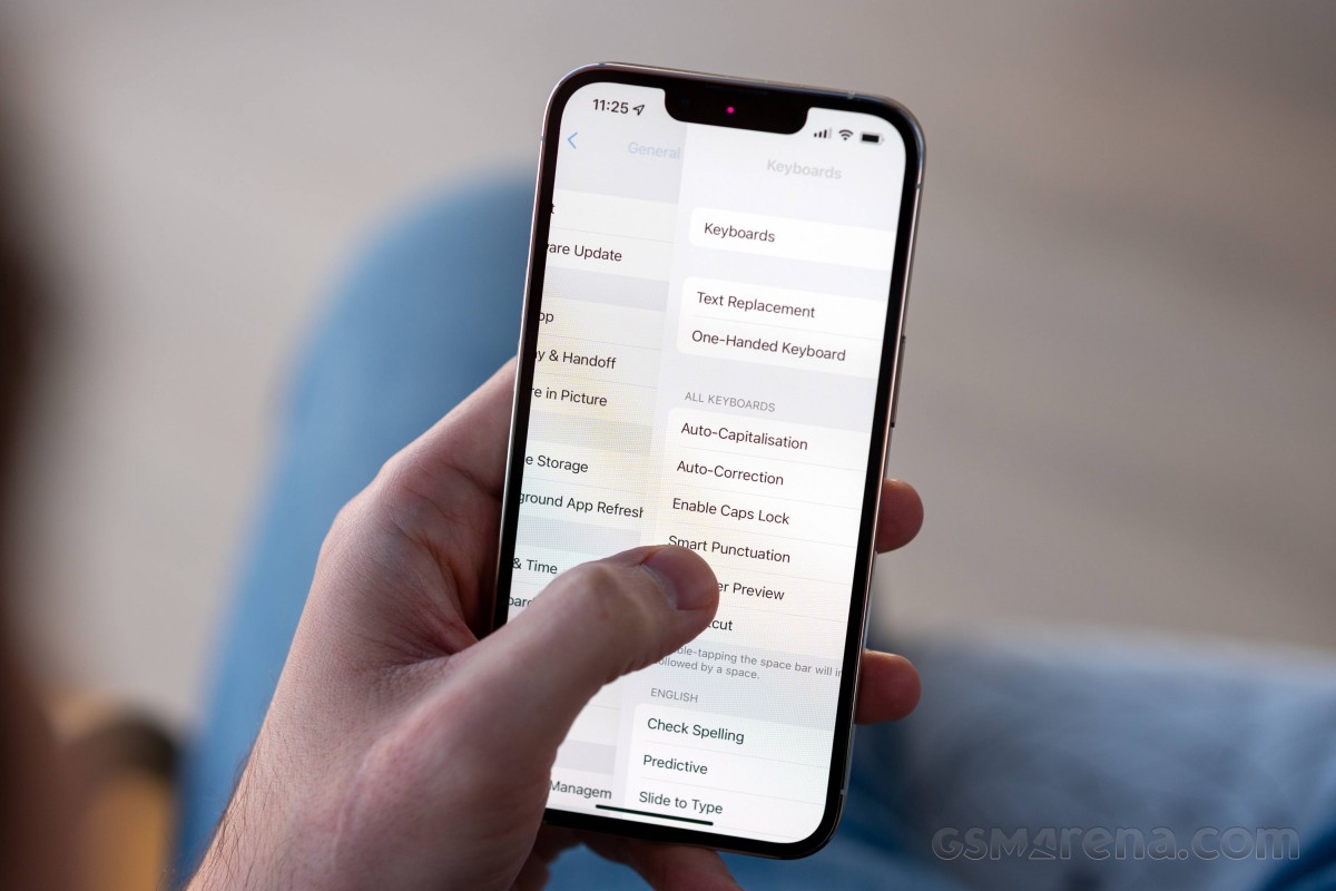
One of the things I can't really de-iPhone-ize is the keyboard, and it's one of iOS' biggest setbacks - it offers limited functionality and minimal options to change that. For one, there's no way to have a number row displayed at all times. A long-standing pain point of iOS' default method of input, it can be sort of circumvented by using Gboard - Google's keyboard at least allows you to have the digits accessible with a long press on the top-row keys. I was used to this long-press way of inputting symbols on Android, functionality that's missing on both the Apple and the Google keyboards.
I used to complain about the lack of a setting to have the comma symbol available at all times (I'm a bit of a stickler for punctuation). As time went by, however, I adopted the swipe-in for a symbol method, and I found it a decent compromise. It was a revelation to find out that Gboard supports it, too, after I had already gotten used to it on the native keyboard.
Mind you, I have no love for any sort of auto-complete, and auto-correct, and auto-anything for my typing, so I can imagine the experience might be different if you let the phone do some of the typing for you. Not me, though.
My typing woes continued into navigating around the text input field. The more experienced iPhone users at the office have been trying to get me to use the tap on the space bar and swipe around method and it does work great. Only it works great in the native keyboard, while Gboard's implementation has its own issues like not being able to move vertically.
But that's the thing - Gboard has other features I find important like the number row workaround I already mentioned, but also haptic feedback on a keypress - Apple's own doesn't do that. I'd appreciate suggestions for a better keyboard that can do everything I want it to, since my App Store hunt for the ultimate keyboard has returned a myriad of god-awful colorful efforts and not one that makes sense practically.
Another aspect of navigation that manifests itself in typing, but is prevalent throughout the UI, is the inability to just tap and get your cursor to appear there. Through years of typing and editing, I've gotten pretty accurate at positioning the cursor where I want it with just a tap, but on an iPhone, the best you're going to get is the beginning or the end of the word - certainly not in the middle as it just doesn't do that. So it's tap to get to the word, then tap and press to move to the middle, and at this point, you're better off just resigning to deleting everything from the end to where you need to edit and retyping the rest.
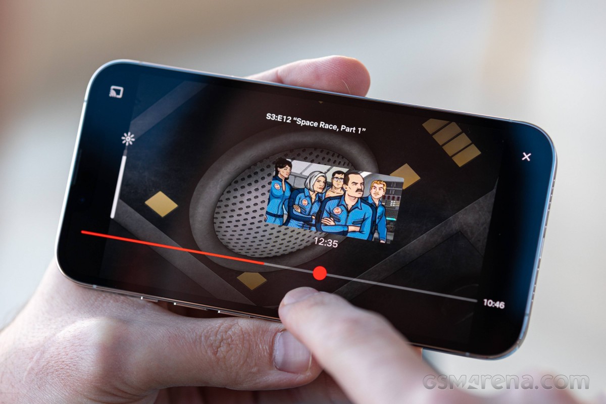
A similar behavior is also present for all things sliders. You're at the bottom end of the brightness slider and want to get to the top - you can't just tap at the top; you've got to touch the slider and drag it in the direction you want. Or a progress bar in a video - you can't directly jump to a point, you have to do at least some sliding on the progress bar to get it to move.
All of this may sound like nitpicking, and I know I'll read a bunch of comments saying I just don't get it or I'm using it wrong. Two months into it, however, I haven't really internalized this concept, and I'll die defending the hill that it's just dumb UI.
More iOS
There are other examples of dumb UI in iOS beyond the ones I already listed on the previous page. The lack of a universal back gesture made for a steep learning curve in my early days on the iPhone. On Android, I was used to being able to back my way out of anywhere and onto the homescreen but that doesn't work here. And it doesn't work for different reasons depending on what kind of screen you're on.
The back gesture, where it does exist, only exists from the left side of the phone. That's actually hardly grounds for complaint in my particular usage since I'm a leftie when it comes to smartphones, and it happens to be on the convenient side. I can imagine I'd have been salty about this too though if I used my phone with my right hand.
So... long-time iPhone users probably know all of this instinctively, but let's quickly break down the different types of 'get me out of here' actions you need to use. Once you've run out of steps to go back within an app, your path to the homescreen is an upward swipe from the bottom - that is, at least, a universal straight-to-home solution.
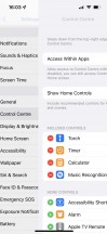
If you've pulled down the control center or any other UI element that has a blurry background, tapping somewhere on the blurry areas will get you out of there. If you're in any sort of image viewing scenario and have a photo on your screen, swiping down on the image is 'back'.
Then there are certain windows you can only get out of with a tap on a 'close' button, and that button is always at the far end of the screen. Ah, just how I remember it on my 3GS ten years ago. Mind you, that one had a 3.5-inch screen.

Types of 'back': Swipe in from left edge • Tap on blur • Tap on buttons at the top • Drag photo down
Having said all that, navigation isn't entirely crap. The task switcher is really slick, the animations are pleasingly fluid, the side swipes on the bottom bar work fine for switching between recent apps. Not groundbreaking stuff, but at least not stuff that's been deliberately kept outdated, unintuitive, or counter-productive.
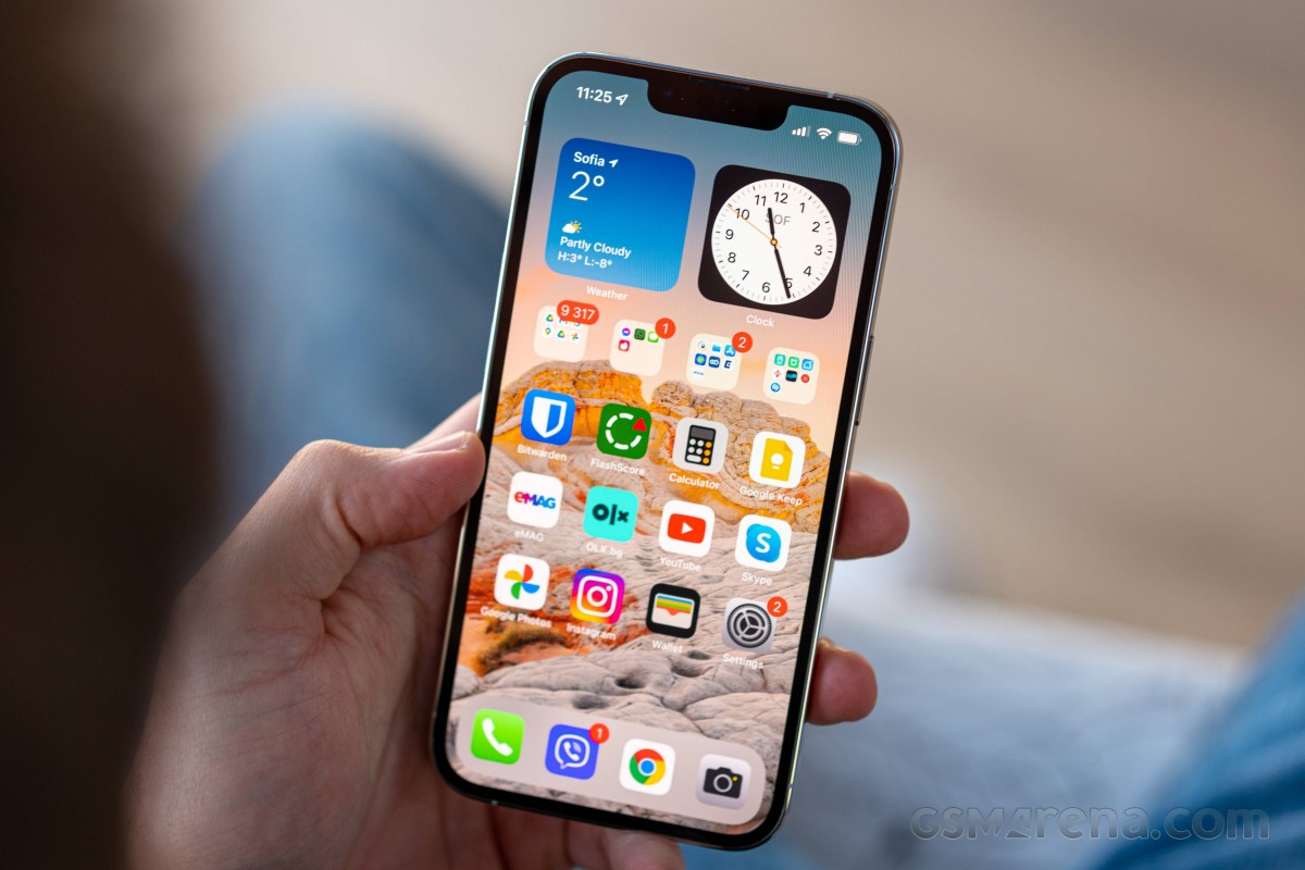
Belonging in all of those categories at once is the homescreen icon arrangement. Aligning the apps towards the top is a remnant of simpler times when screens were smaller, but it is so out of touch nowadays. With the advent of widgets on iOS 14 in 2020 (is there really any point in making fun of that timely development?), you can stuff some of those on top of your homescreen to get the extra padding needed to bring your icons lower, but come on.
I was used to having all the apps I use in a single row of folders above the 'dock' (the bottom-most row of icons that doesn't change as you swipe sideways between homescreens) and keeping the rest of the screen empty, so I can admire my daily wallpaper and, really, to have a clutter-free homescreen. I can't do that here - I either have to pack widgets up top, or just spread the apps I use more often and stick the rest into folders. In either case, I wouldn't be seeing much of my wallpaper anyway. Then again, there's no straightforward solution to automate daily changing wallpapers, so I might as well just cover it with icons and forget about it.
Moving on, one thing I've been missing on the iPhone 13 Pro is always-on display functionality. I had come to rely on this functionality on Android for quickly checking the time or notifications without waking up the phone, so not having it here required some adjustment.
I guess there's a silver lining to this as I'm now probably less anxious about getting new messages and only check for that when I do grab my phone, as opposed to constantly keeping an eye on it. While I probably would have stuck to my bad habits of continuously checking for notifications and replying instantly if I had AoD, I'd argue that having the option for it is better than not having it.
In the end, as expected or, more accurately, as planned, I'm no fan of iOS. I've learned to live with it, and there are certainly bits about it that I like. Ultimately, however, I enjoy my iPhone, and I am sticking to it in spite of the operating system. Because it really has its positive sides. Follow along on the next page for my account of those.
Build and 'how it makes you feel'
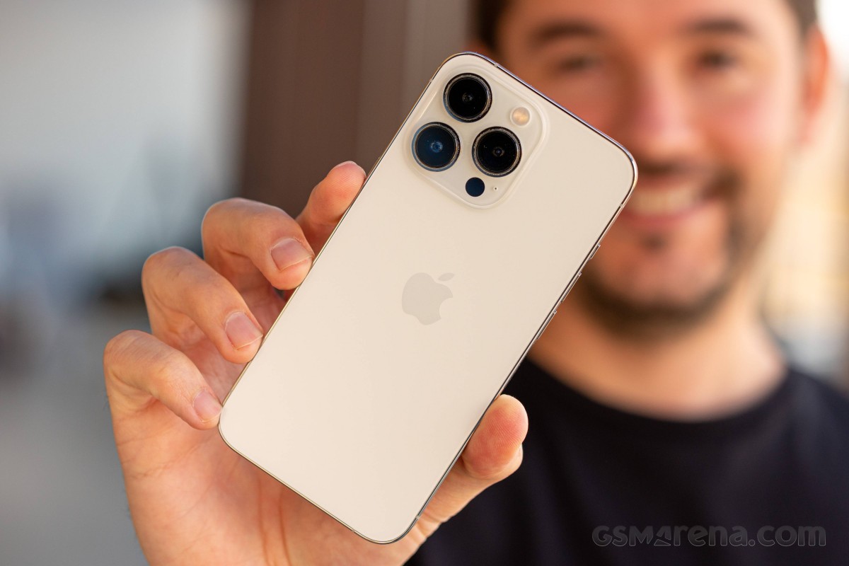
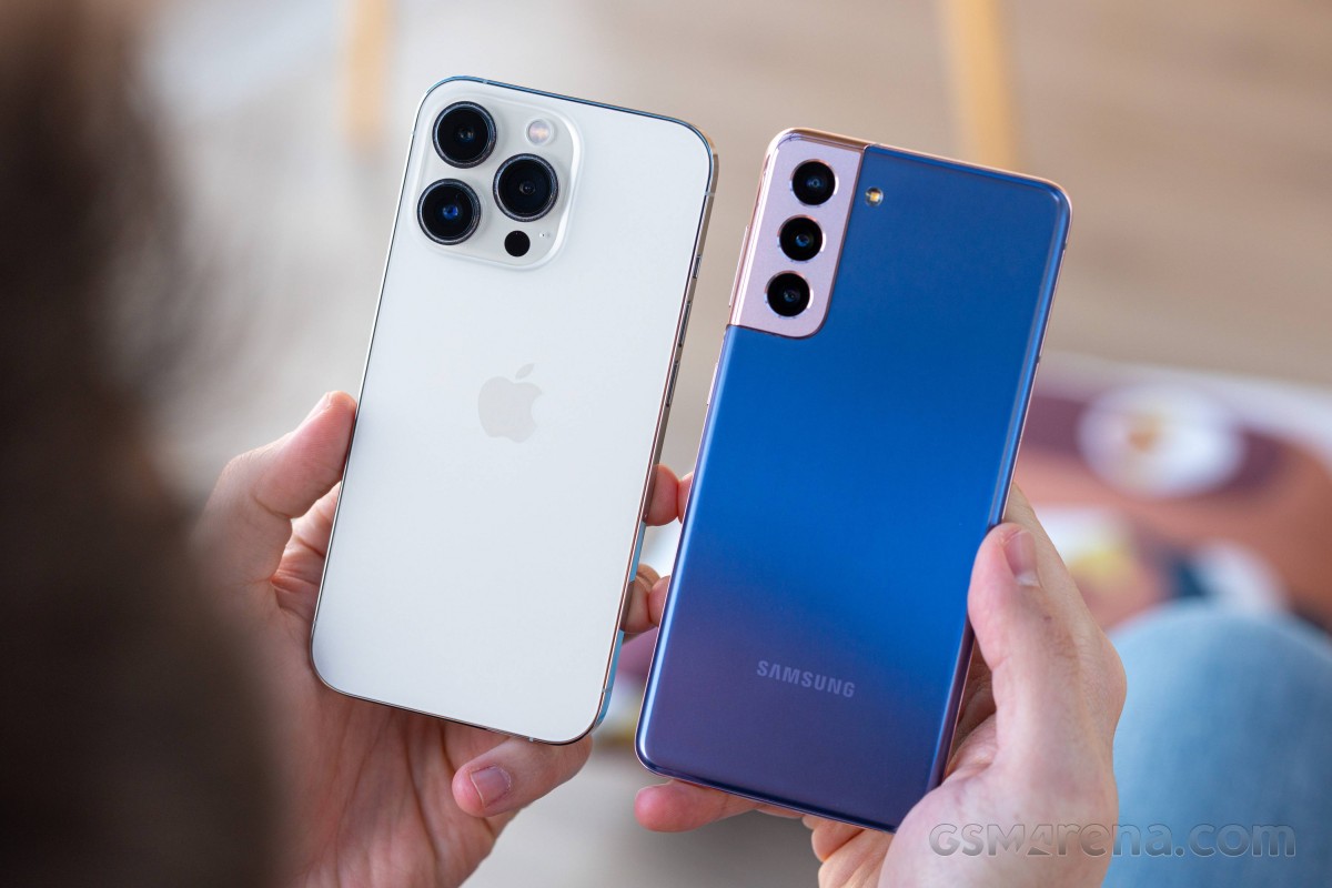
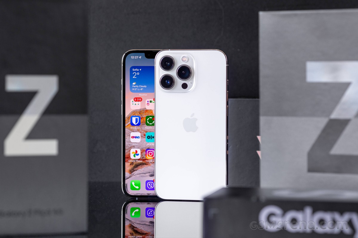
The build quality was one of the main reasons to get an iPhone. The 13 Pro has a somewhat unique blend of poshness, small size, and top-end internals that eludes essentially every other phone available.
The Galaxy S21 has the right components and is nicely pocketable (is also a lot lighter than the 13 Pro) but is plastic on its back and so indistinguishable from every other Samsung that it doesn't strike my ego in any meaningful way.
The Xiaomi Mi 11 Ultra's ceramic back and curved edges all around make it look and feel properly expensive. On the other hand, the gigantic camera bump immediately identifies it as this specific model to those who know, and all but guarantees that those who don't know will ask. It's an important aspect of your phone if you're in the business of reviewing phones - we like talking about them. We like a phone that makes an impression. But for all that's good about the Mi 11 Ultra, it's too big for its own good.
The foldables then. Both the Flip and the Fold have a wow factor to go around, but each comes with its trade-offs - the Flip's camera and battery life is middle of the road, while the Fold is huge in either state.
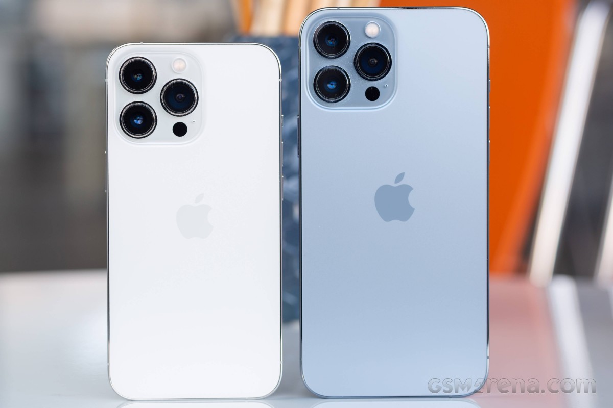
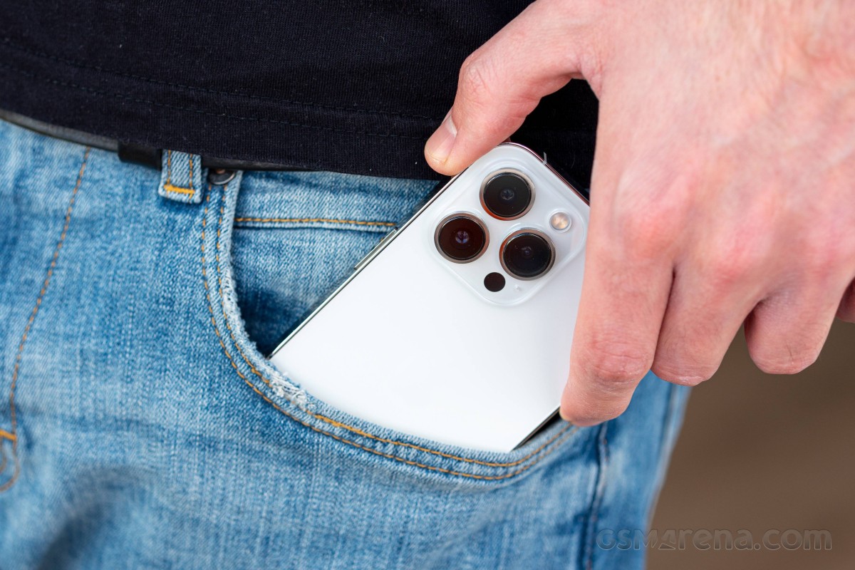
The iPhone 13 Pro is just big enough to not be too small. I toyed with the idea of getting a mini but dismissed it on the grounds of camera hardware, and I'm glad I did - the mini would have probably been too compact for its own good. The 6.1" screen size of the 13 Pro is sufficient for YouTube, sites are comfortable to read, the width is good for trouble-free typing on the keyboard - it's just the right size.
It's a heavy phone, there's no denying that. The iPhone 13 Pro's 204 grams are a handful more than the full-size 6.7" Galaxy S21+'s. In typical iPhone owner fashion, however, I'll say that it's a good thing. There's a psychological association between weight (or, in fact, density) and expensiveness, and it's pretty strong with the iPhone.
The steel frame contributes to that subjective premium feeling in two ways. The first one is indirect, thanks to its weight. The 13 Pro is 30g heavier than the 13, and with most things being identical between the two, it's down to an extra camera and the steel frame to account for the difference. I think the latter can take responsibility for a good chunk of it, I think - the non-Pro's aluminum frame has got to be lighter.
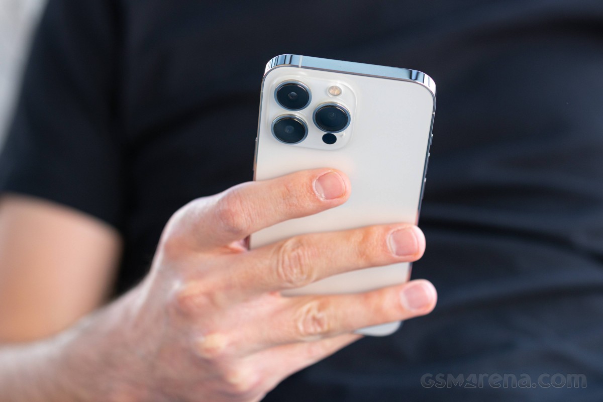
The other aspect of the frame's perceived high quality is a bit hard to put into words but is again related to the steel vs. aluminum debate. Aluminum is the 'default' metal for smartphone frames, and the steel on the iPhone Pros sets them apart from the masses. And if only the Pro models in what is already one of the most expensive phone lineups can have it, it has to be superior. Reading this, a frightening realization is sinking in that I might be on my way to becoming an Apple fanboy. Or maybe steel does feel better. Let's hope it's the latter.
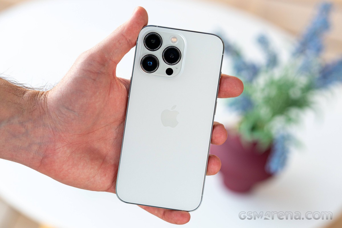
I'll be the first to admit that the steel does not necessarily look better. The shiny high-gloss finish on steel iPhone Pros will pick up any fingerprint it comes into contact with, while the matte non-Pros are a lot better at masking those. Some say that the Silver colorway with its practically mirror-like surface is the worst in this respect, which I may have to concede is true. I like white phones, though, so there was no room for deliberation here.
I've also been warned that it'll be the easiest to scratch and show dings, but I'm yet to see any two months later. I'm not careless when handling my phones, but I'm not overly protective either - this one has been caseless throughout its lifetime, and it's looking flawless.
There's the other aspect of having an iPhone, and it's a very superficial one. It wouldn't necessarily come through as a better person for thinking it, much less putting it into writing, but the iPhone inspires an elitist feeling of superiority over phones of other makes. 'Yeah, sure, your Galaxy is nice, but it's no iPhone' type of thing.
There's somewhat of a deeper spin to it, I'd like to think, and it's that having the latest iPhone frees you from constantly thinking about upgrading or switching to a different model. They only put out one iPhone Pro per year (in two sizes, but that's not the point), and there isn't going to be a better one for a whole year. Naturally, that's not a problem many people have, but it's been an issue in my (admittedly, privileged) reality for several years now, and I have seemingly escaped it.
It's not just about snobbery and insecurities, though - there are some objective, measurable, universally accepted pros to using an iPhone.
Battery life
I was used to charging daily, whether it was the Galaxy (any of them, really) or the Mi 11 Ultra. The Galaxy S21 would, on occasion, struggle to make it to bedtime, while the Mi 11 Ultra fared a lot better, but I still wouldn't feel comfortable starting the next day in the low 30s in the battery percentage indicator.
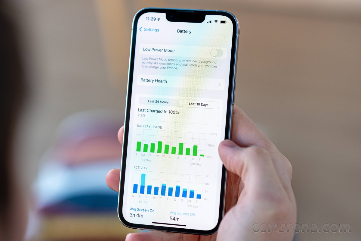
The iPhone has taken battery anxiety out of the picture almost completely. It lasts longer than anything I've used in recent years (no iPhone in there, but Apple says it should be better than previous iPhones, and our tests seem to confirm it) and does so regardless whether I've played with it a lot or it's just sat quietly in the corner. I have no overnight charging routine in place now, and it's morphed into more of every-other-day charging at random times of the day, which works fine for a desk job.
Another anxiety-reducing aspect of iPhones is that they simply don't like telling you how much battery they have unless you specifically ask. If it was an Android phone, I'd have the battery percentage showing in the status bar as well as on the AoD. On the iPhone, neither is a possibility, and I now live a better life, not knowing precisely how much battery I've got left, but not worried it won't be enough either. It may look like I'm trying to make light of missing features by spinning their absence as a feature in itself, but I'd like to call it just sharing my experience.
I have to admit I haven't really traveled anywhere since I got the iPhone, so it hasn't been tested in a tourist type of scenario - constant navigation and picture-taking, all at max brightness and away from the comforts of an always accessible charger, so I can't be sure how it would handle those, but I don't doubt it will be just fine. I might never find out, though - tourism isn't exactly encouraged these days, is it?
Display
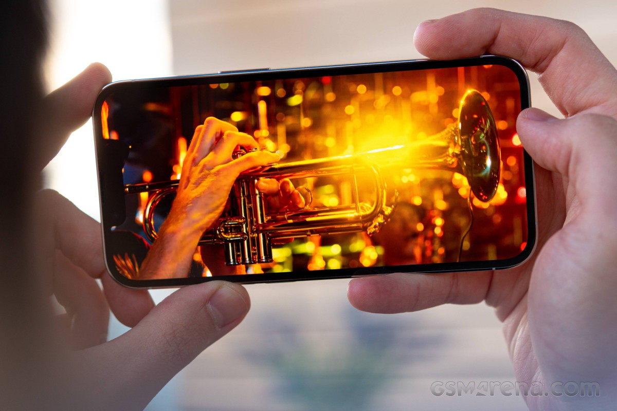
Speaking of maximum brightness, the iPhone 13 Pro's display has a lot of it. It's one of few phones that can go above 1000nits in our standardized test (plenty can do it for small patches when showing HDR content - that's different). It manages to maintain spectacular accuracy throughout the brightness range.
I don't do anything color-critical on my phone, so the accuracy bit isn't a top priority, as long as the display doesn't have a cold tint (which it doesn't). I have True Tone enabled, something I would have made fun of people doing before I got the iPhone. Now that I'm on this side of the argument, I'm still struggling to defend its use with rational reasoning. It's on by default, I've kept it that way, and I've never been unhappy with the results. So I guess it just works?
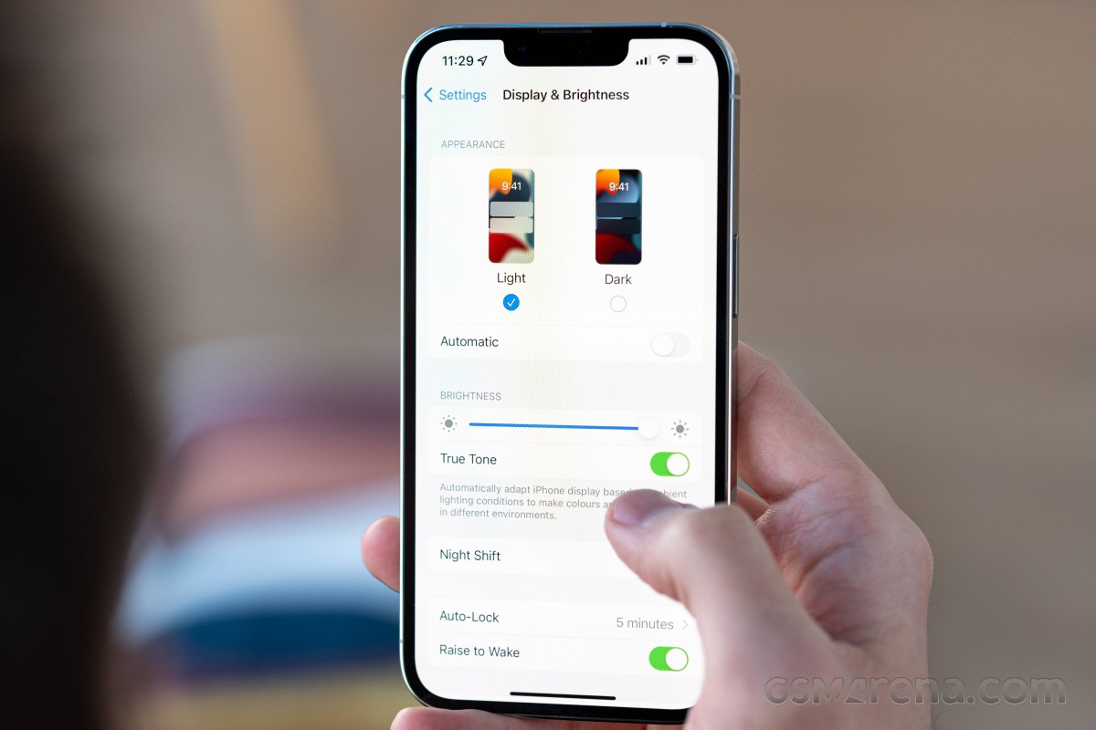
I'm very pleased with the auto-brightness behavior, which always appears to keep the screen shining as bright as I'd want it to and makes its adjustments with nearly invisible subtlety. In particularly dark situations, it might require a touch of manual intervention to lower the brightness further, but I've been told I keep my screen too dim, so the issue could very well be my perception. Perhaps the phone will eventually learn from my input and dim down as low as I'd like. Or not, it doesn't happen often enough for it to be a big deal.
The 120Hz refresh rate, a first for iPhones this year, is a welcome and overdue development but hardly something to rave about - I am no stranger to using HRR screens on the other side of the OS divide. Apple fanboys may insist it's the best implementation, but I have no horse in this race - I'm just enjoying the smoothness and responsiveness of mine.
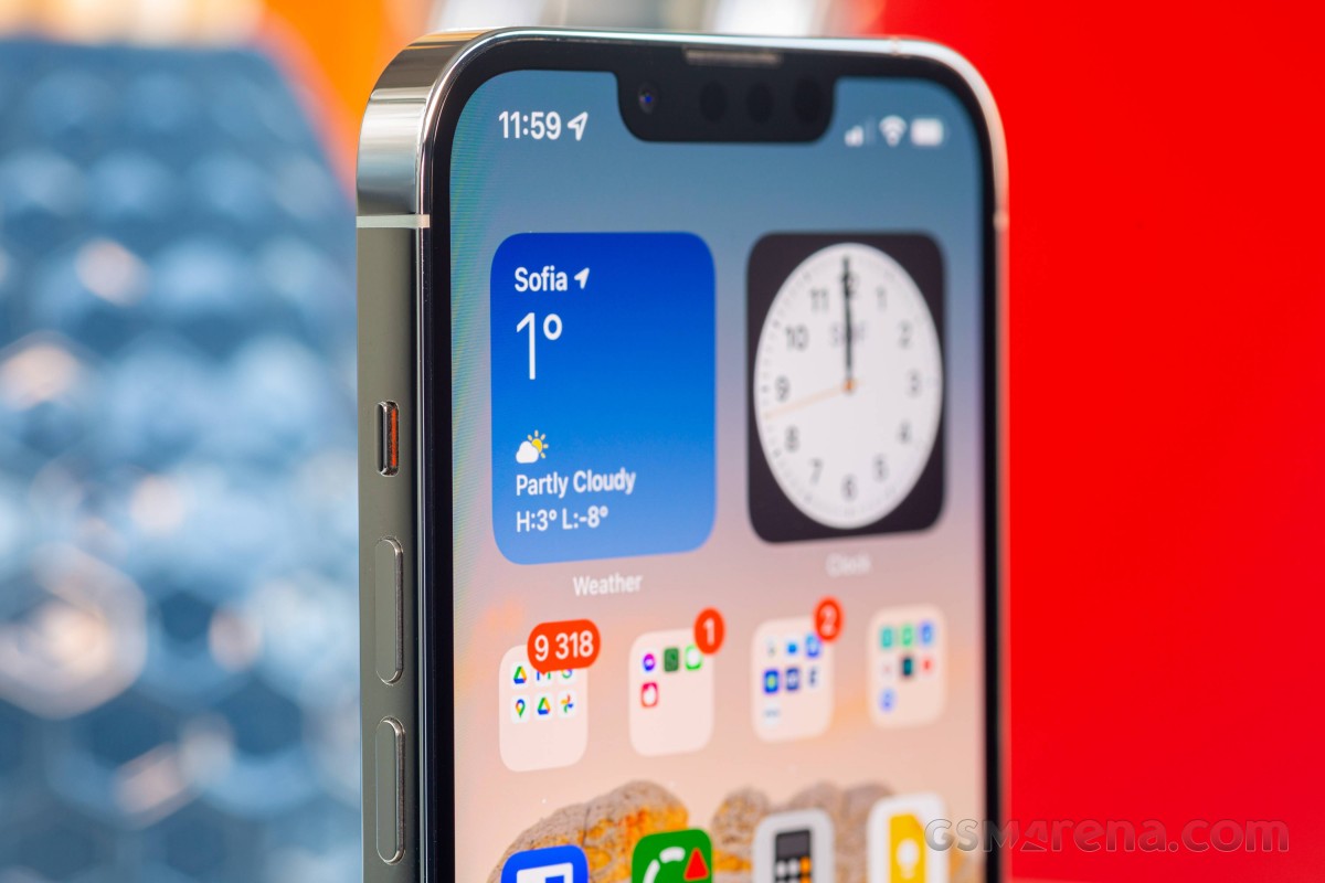
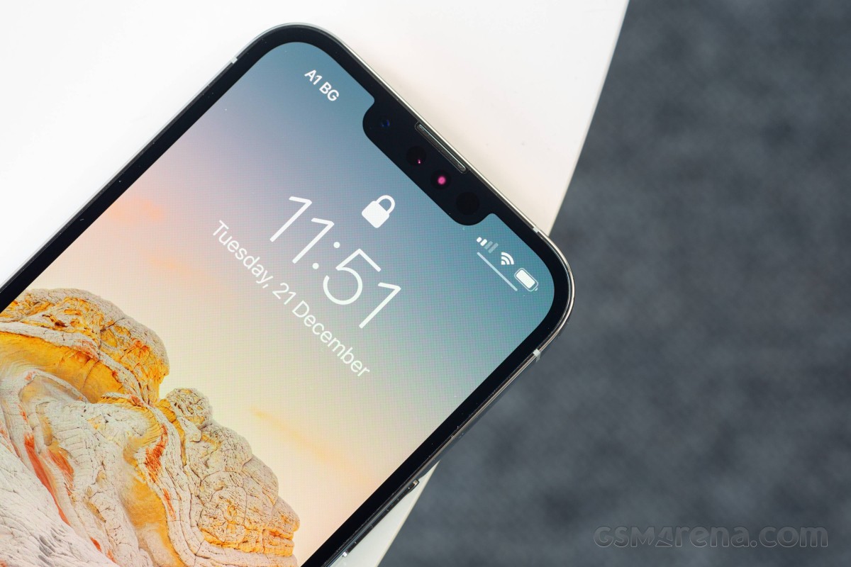
I have stronger feelings about the notch, but not really from the standpoint of looks or usability - you're staring at your phone for hours every day, and the notch barely registers. The sentiment is more along the lines of 'they should have found a workaround by now'.
FaceID
I am a fan of what it enables, however. I never really understood the appeal of FaceID when looking from my Galaxy perspective, but now that I've actually used it for a while, I'd rather not go back.
Sure, facial recognition is something Androids have had too, and some even employ a similar 3D mapping technology to Apple's. But I always seemed to prefer the 'tactile' experience of a fingerprint scan, with the Galaxies' ultrasonic implementation a particular favorite of mine. Warnings that facial recognition wasn't as secure on those didn't help, even if I don't really have any sensitive stuff to protect on my phone.
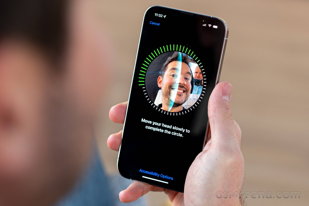
Not given the option to use fingerprints now and forced to rely on my mug for authentication, I've come to enjoy the immediacy of FaceID and its always-works quality. I'd certainly appreciate an under-display TouchID solution in addition to FaceID, whenever they feel the technology is 'mature' and 'ready', but I'd probably still stick to FaceID. Then again, they may very well scrap FaceID when TouchID comes back... I'll be happy the notch will be gone, but I'll miss FaceID for sure.
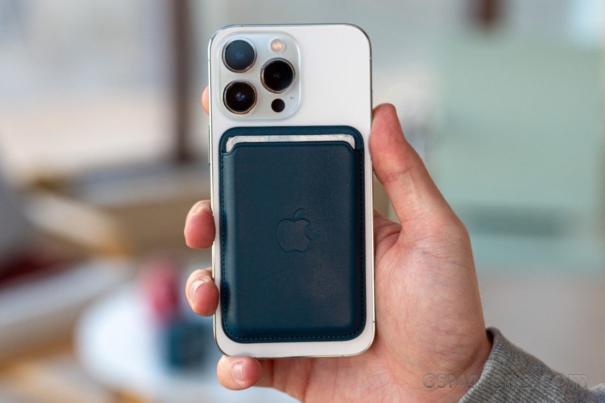
Magsafe wallet
The appeal of the tiny not-even-a-wallet snap-on Magsafe accessory was one of the driving factors in my decision to switch to iPhone. I hate carrying unnecessary stuff around on me all day and have been on a constant quest for minimizing keys and wallet contents. The Magsafe 'Wallet' helped immensely in that latter area.
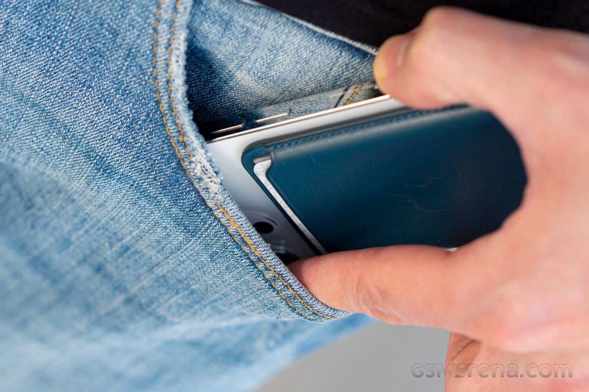
Its capacity is small, true, and I've had to find ways to fit into its 3-card limit. Some loyalty cards had to stay in the car together with my driver's license (contextual storage - only with me when I have use for them), while others remain at home unless I know for a fact I'll be needing them that day. Cash got the back jeans pocket, coins I try to avoid carrying anyway. Some will say that's too much compromise, but these are my pockets, and for my needs, the iPhone+wallet combo has worked beautifully.
I have no interest in arguing with people on the internet, so I'll just use this opportunity to state that the wallet attaches with just the right amount of force. It's never once parted ways with the phone by accident, and it doesn't catch my pocket when I'm putting the phone away. I do, admittedly, have the habit of widening the pocket with my index finger, wallet or no wallet. I can also easily remove the wallet from the phone inside my pocket and only take out the wallet itself if the situation calls for that.
Other perks of having a magnet wallet include the ability to slap it to the side of the steel cabinet next to my desk in the office or attaching it to the steel basket I have by the door at home. Additionally, the wallet serves as a form of protection when placing the phone on a hard surface, without being a 'case', per se. It also all but disappears in the palm of my hand when it's on the phone - it's there, but it doesn't really make the phone feel thicker.
It's perfect. I don't know how I've lived without it.
iOS
I've tried to make it clear that I dislike iOS - almost hate it with a passion. That's not to say I don't enjoy some bits of it. If my complaints about it sounded petty, the things I like would feel even more trivial, but here are a few.
Airplay just works. I've never been able to cast things to my TV from any app this easily on my Android phones. It could be that I never bothered looking into it, but even that in itself is a win for Apple's implementation - it's so simple that I don't have to think about it.
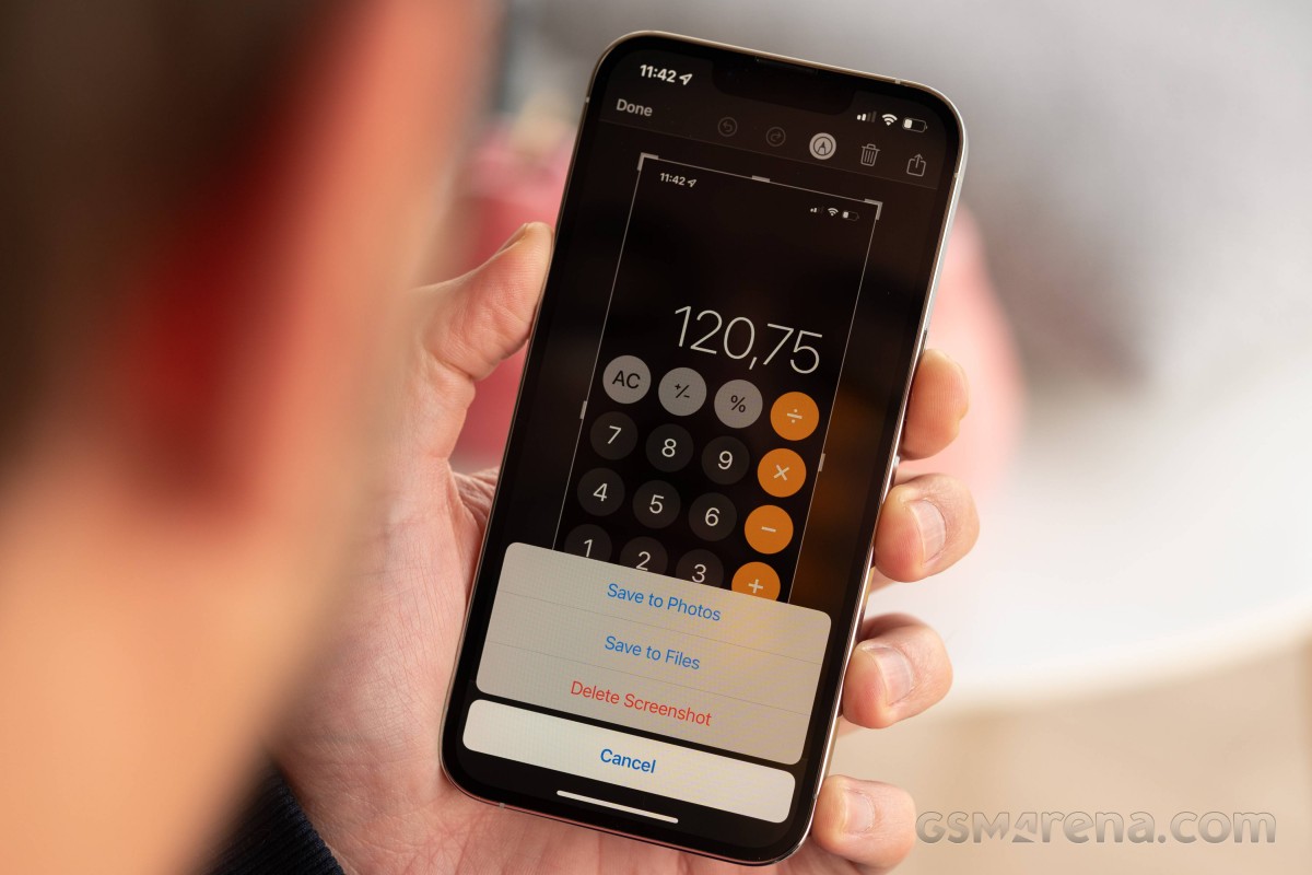
Screenshots don't have to be saved - imagine that! You take a screenshot, crop it, annotate it, send it whichever way you were going to send it and delete it, all from the same screen. I have countless useless screenshots from my Android past just sitting on servers cluttering my Google Photos - but not anymore.
Google Chrome has its navigation bar on the bottom. Safari may be nice and everything, but it doesn't sync with my desktop, and that's essential functionality for me, so I'm using Chrome. The good thing is that Google has tailored its browser's iOS version to resemble Safari and its navigation bar is on the bottom. This was an experimental option in the flags menu on Chrome for Android every now and then, but all it took was an update for the flag to be switched off, or removed entirely (as Google likes to do), and it was still missing on Android last time I checked. I really wish they would bring it back because, from my experience on iOS, it works great.
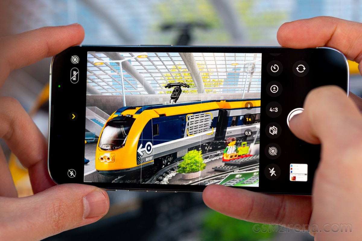
Camera
I'm filing this in the 'neither here, nor there' category. The iPhone 13 Pro has the same cameras as the Pro Max, which was instrumental for enabling that best-you-can-get feeling in this generation - the feature parity was lacking in last year's Pros. It's the best you can get on an iPhone; however, and Androids have as good or better alternatives, so the camera was hardly a major argument in favor of the 13 Pro when I was contemplating getting it. It was the other way around - the camera wasn't a dealbreaker, unlike with the 12 Pro.
Naturally, it has its specifics, and I don't necessarily agree with everything Apple is doing. For example, I'd take a more aggressive Night mode - if not in the auto state, at least at the max end of the slider.
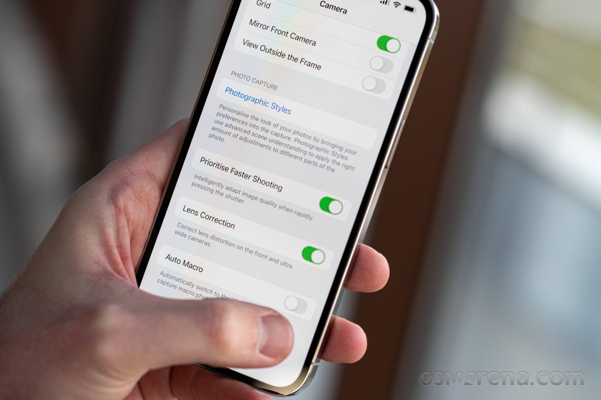
Also, this whole thing with the photographic styles is keeping me uneasy all the time. Am I using the right one? Maybe I like it now, but what if I want to change it later on? Am I going to forget to put it back in the 'standard' position after I'm done using it? Did I put it back in the 'standard' position last time I used it? Should I pick just one style and stick with it?
A handful of tiny UI quirks bug me as well, like the little shift of the viewfinder when you pull up the quick settings menu. And the fact that the other settings aren't within the camera app itself, but the main settings menu instead. But I guess I've just accepted that iOS is iOS, and that's that. At least they now let you disable the auto macro mode, which switches from the main to the ultrawide camera when you get too close to a subject - that was a major source of frustration in the beginning.
A feature Apple introduced with iOS 14, Back Tap, has meant that I can launch the camera with no touch input. I've always appreciated phones that can open the camera with, say, a double press on the power button because that lets you operate it with gloves on and launch it from any state of the phone - locked, unlocked, in an app. That's the case with the iPhone, and Back Tap has worked very reliably for me. Now, if only it could change between cameras somehow.
All things considered, I enjoy using the camera, little as I actually do - when not going places, you're left with your cats as subjects, and you can only take so many pictures of your cats.
Conclusion
I've been jumping back and forth between different Android phones this year with particular intensity - it's more or less how it's been after the Galaxy Note 10, but 2021 was especially tough. While I did spend the most time with the Galaxy S21, it never quite felt right. So with Androids being just different enough between them to irritate me but not special enough to make me look past their flaws, it made sense to do a total reboot and switch to iOS.
That is to say, a switch to iPhone because I maintain that iOS is a dated and backward excuse for a mobile OS. It's got downright stupid UI choices that are stuck in the past and get in the way of daily usage, even if you do eventually get used to them. But it's the OS that goes with the phone, and I've accepted the bad with the good.
The iPhone 13 Pro itself is a pretty great phone. It's just the right size for me, and it's the most premium offering in that footprint. The superb battery life and top-quality display are easy to love, too, while FaceID and even the notch took practically no time to get used to. Meanwhile, the Magsafe Wallet has been a true gamechanger for my EDC.
I'd be the first to admit that as GSMArena staff, we've been privileged and even spoiled if you like. Even when picking up a new phone, you can already hear the question in the back of your mind "That's fine, but where do you go next once this one inevitably ceases to excite you?" I almost felt compelled to write this piece as a way of explaining that, for once, I am happy where I am, only to be met with comments like 'it's articles like this one that make you reevaluate your choices, and you'll be replacing that iPhone in no time." But I don't think I will - not this time around. January 2022 will seemingly be heavy on new phone announcements, but I don't see anything on the horizon that can potentially change my mind. Until it does, of course. Stay tuned!
from GSMArena.com - Latest articles https://ift.tt/3sMQllt
via IFTTT
Bagikan Berita Ini


0 Response to "Back to iOS after years of Android use"
Post a Comment