Oppo silently decided to ditch its iconic green logo color and will start using black accents from now on. Online users in China noticed the changes in profile images on Weibo and eventually, the company decided to reply to one fan that green remains an important brand component, which will be used in “interactive visual designs to enrich every scene where the brand meets the users”.


Oppo China homepage: Before & After
The statement also read that in the future, the logo will gradually reduce the use of color and will appear in a monochrome form, meaning it is not removing just green - it is removing all colors. This is visible on the company website, where the green squircle is gone and the pages went through a redesign.

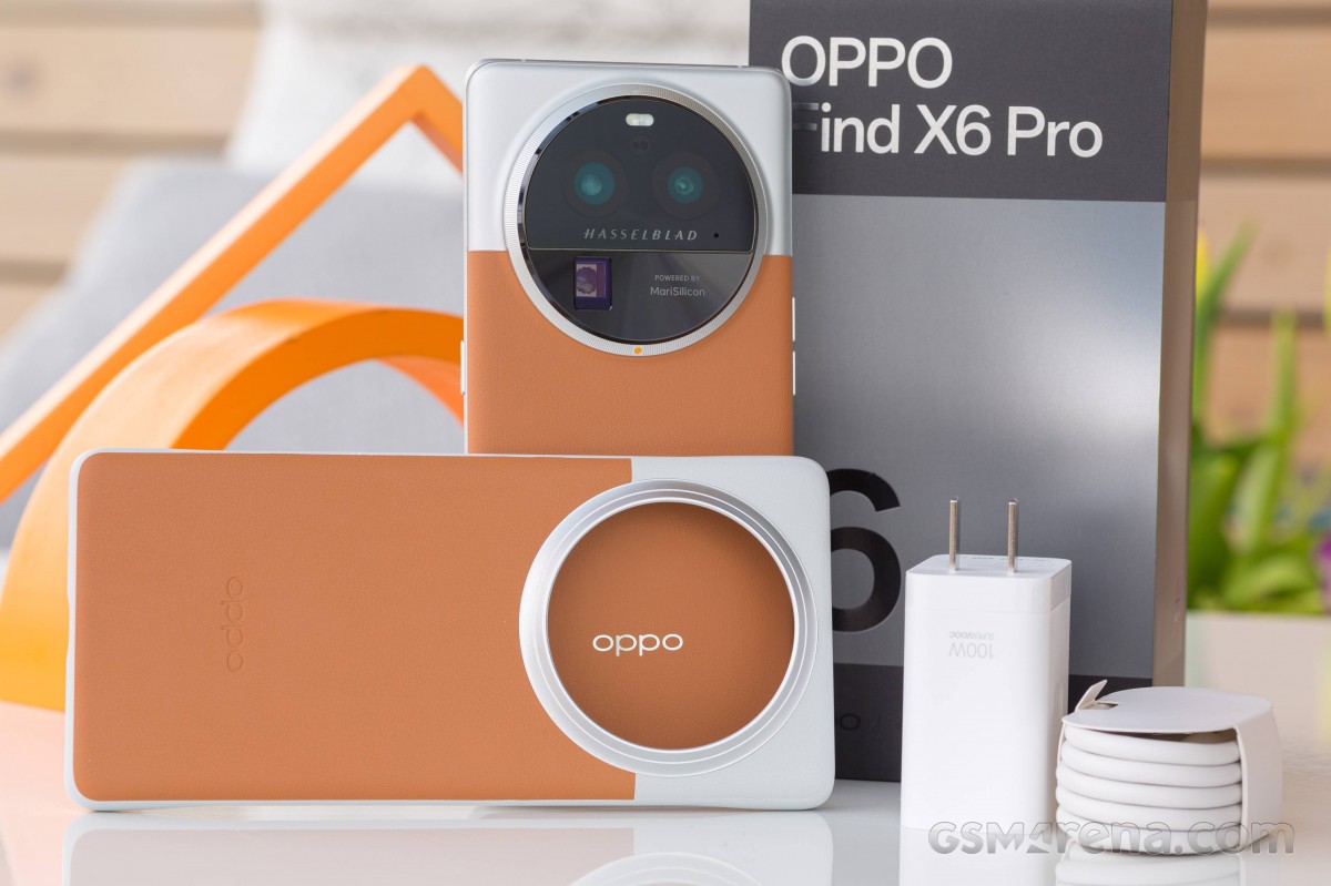
Looking back, the green logo has been gradually removed from Oppo’s marketing communication for a long time - it is indeed going for white letters that sometimes are adapted to different visual elements; for example, the purple variant of the Reno10 Pro has violet Oppo letters on the box, while the logo is silver on the Find X6 Pro.
from GSMArena.com - Latest articles https://ift.tt/sfiqpvU
via IFTTT
Bagikan Berita Ini


0 Response to "Oppo moves away from green in latest logo redesign"
Post a Comment